Meowllo and welcome to the new blog! Glad to have you here! This is our new blog where we'll talk about Little Kitty, Big City game development and other interesting happenings that might be fun.
I hope to get something up here at least once a month and talk about what's going on with the game.
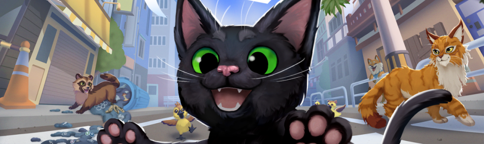
For the first post, I thought I'd show how I came to the final version of the Little kitty, Big City logo! Logo design is always a fun journey as it need to represent the thing you're making and set the appropriate expectations, all in one little package. Here's how that journey went.
After deciding on the final name of the game, I started looking for other logos that had a similar feel that I wanted to capture. Something fun that had color and movement and 3D! I was really interested in capturing a nice 3D feel. 3D always feels more alive to me.
Here are a few that I gathered to use as inspiration.
I started with this first just to try and figure out the feel and composition.
It was also at this point that I realized, I probably couldn't do a good enough job myself, so I enlisted a friend of mine to help. These were the first versions we played around with while we tried to decide what parts would be 3D, would the cat be in it, how playful should the font be, etc.
Now it was time to think about color. At this point in the project, we didn't really have a color palette, so whatever we choose, would probably define things going forward. That may seem scary, but you have to put a stake in the ground somewhere, right? Ok, let's go.
We used some concept art that Alexandra Kern made for me very early on (https://www.zandraart.com/) as a back drop to see if we could get the feel right.
At this point, my friend who was helping out above could no longer help out, so Juliana Chen (http://www.julianachen.net/) helped me out!
Things were finally coming together! Juliana started using different colors and values to help differentiate the different parts and figure out how we wanted things to read! This is also where things started to feel really crisp!
Some basic color explorations as well as experimenting with perspective.
Me playing around with an outline.
More color experimentation.
Here is where I tried to get more of the "city" into the logo which I did by adding the top silhouette.
The silhouette seemed to work ok, so we worked on fixing the angles and perspective.
A few color tweaks and some polish and we're almost there!
And there you have it! One more update to the Little Kitty model and we called it done!
I hope you enjoyed this logo journey and this gives you an idea of what went into getting the final logo. Until next time!
- Matt